![]()
Recently, while checking out the graphics drawing tablets there are available in the market, I was surprised to see a lot more options. Wacom continues to be the prominent brand in the market but many other brands of graphics tablets have appeared in the recent years.
This article is a guide for those considering getting a new drawing tablet.
Onslaught of competition
Have you heard of brands like Huion, Turcom, UGEE, Monoprice, VisTablet and PenPower? Apparently, some of these brands have been around few many years. The one common point these brands share is that they all target the lower-priced market at budget conscious consumers with really attractive pricing.
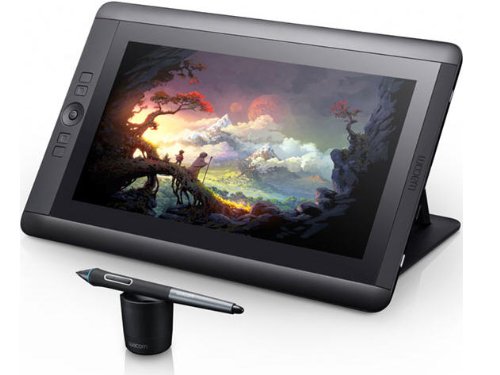
This guide looks only at the simple non-display tablets from the companies mentioned above. Display tablets such as the Cintiqs, or those from Huion and Bosto will be in a separate post.
Rebrand graphic tablets
With so many brands to compare, I suggest looking at just Wacom, Huion and VisTablet. Several companies, such as Turcom and Monoprice, are actually just selling rebrand tablets from Huion. Physical designs of the tablets look exactly the same, just that brands slapped on are different.
Wacom tablets are priced the highest among the three. Huion is cheapest, and VisTablet is in between.
FACTORS TO CONSIDER
Several factors to consider when getting a drawing tablet include pressure sensitivity, size, drivers, features and of course the price.
Having a stylus with good pressure sensitivity is a must. Tablets nowadays go up to 2048 levels of pressure sensitivity. The Wacom Intuos 3 that I'm still using has 1024 levels and that is quite adequate. So definitely get at least 1024 levels or above.
Another feature good to have is the tilt sensitivity. This feature depends on the support of graphics software. This appeals more to those who use brushes that can make use of the tilt sensitivity, e.g. airbrush.
Most drawing tablets are designed for widescreen monitors nowadays. Common sizes are 10 by 6 and 8 by 5 inches where the ratio is around 1.67:1 (a widescreen 16:9 monitor has a ratio of 1.78). Just be careful not to get the wrong proportion so that you can maximise the use of the whole of the drawing area.
Other features to consider but non are deal breakers (at least to me) are things like having an eraser on the back of the pen, customisable shortcut buttons, touch function and wireless capability. I've always preferred using the keyboard with the pen so the lack of eraser and shortcut buttons don't bother me.
To determine what size to get, you should take into account the size of your monitor. 8 by 5 inch is a good size to get, and if you have more budget the 10 by 6 inch. Personally I would go for a 10 by 6 inch because I use a 27-inch monitor at home. The higher the tablet to screen ratio, the bigger the tablet, and the more expensive it will be. Drawing on the tablet is intuitive but will need some time getting used to, and some training of your muscle memory. With a larger surface area, you have more room to manoeuvre for adding details. Don't forget to take into account how much free space your table has also.
The last important factor is the driver support. The drivers must be able to support the OS you're using, Windows or Mac. Also check if your drawing software is supported. Most tablets work well with Photoshop. But for lesser known software like GIMP or PaintTool Sai certain functions, such as shortcut buttons or pressure sensitivity may not work.
Important note on drivers: Windows users are recommended to install the drivers before plugging in the tablet. Otherwise, Windows will install their own drivers, and the pressure sensitivity will not work, and sometimes the Windows driver will be difficult to uninstall. This applies to tablets for all brands.
Alright, let's look at the drawing tablets that are available out there now.
COMPARISON OF DIFFERENT DRAWING TABLETS
WACOM
Wacom has consolidated the product lines for the pen tablets into two groups, the Intuos Pro and the Intuos Pen. Confusing? Yes.
![]()
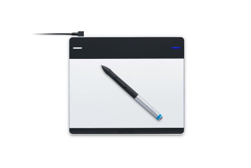
Wacom Intuos Pen and Touch
The Pen and Touch are the entry level tablets from Wacom. They replace the earlier Wacom Bamboo tablets, namely the Bamboo Splash, Bamboo Capture and Bambook Create. The new models are cheaper than the old Bamboo.
Official retail price is from $79 to $199.
Here's a table comparing the key specifications:
| Product | Pen Small | Pen and Touch Small | Manga Pen and Touch Small | Pen and Touch Medium |
| Model No. | CTL480 | CTH480 | CTH480S2 | CTH680 |
| Active Area | 152 x 95 mm, 6 by 3.7 in | 152 x 95 mm, 6 by 3.7 in | 152 x 95 mm, 6 by 3.7 in | 216 x 135 mm, 8.5 x 5.3 in |
| Pressure levels | 1024 | 1024 | 1024 | 1024 |
| Tilt Sensitivity | No | No | No | No |
| Resolution | 2540 lpi | 2540 lpi | 2540 lpi | 2540 lpi |
| Reading Speed (pen) | 133pps | 133pps | 133pps | 133pps |
| Pen | Intuos pen without eraser | Intuos pen with eraser | Intuos pen with eraser | Intuos pen with eraser |
| Multi-touch | No | Yes | Yes | Yes |
| ExpressKeys | 4 | 4 | 4 | 4 |
| Software bundle | Autodesk Sketchbook Express & ArtRage Studio | Autodesk Sketchbook Express & ArtRage Studio | Manga Studio Debut & Anime Studio Debut | Autodesk Sketchbook Express & Art Rage 3 |
| Official retail price | USD $79 | USD $99 | USD $99 | USD $199 |
Note that the base model simply called Pen (Small) has no eraser on the pen and multi-touch.
Here are the pros and cons of the Intuos Pen and Touch
+ Decent build quality
+ Drawing surface has a slight texture that evokes the feeling of traditional medium, e.g. the paper.
+ 1024 levels of pressure sensitivity works well and good enough for beginners
+ Buttons on the tablet and pen can be programmed to keys, mouse clicks and other functions
+ Tablet is responsive even on a cheap laptop
+ Multi-touch conveniently detects fingers for zoom and scroll
+ Hand can rest easily on surface without registering unwanted touches
+ 3 extra nibs are hidden inside the lid in the little compartments on the back
+ Pen is light and comfortable
+ Pen does not require batteries like competitors'
+ Works for left handed users also
+ Driver installation is easy
- Pen is thinner that others from Wacom product lines
- Tablet may have problems being detected when computer is waking from sleep
- Cord is short
- Drawing surface scratches easily
- Some users report shaky lines
- Price is higher than competiton
You can see the updated prices below:
![]()
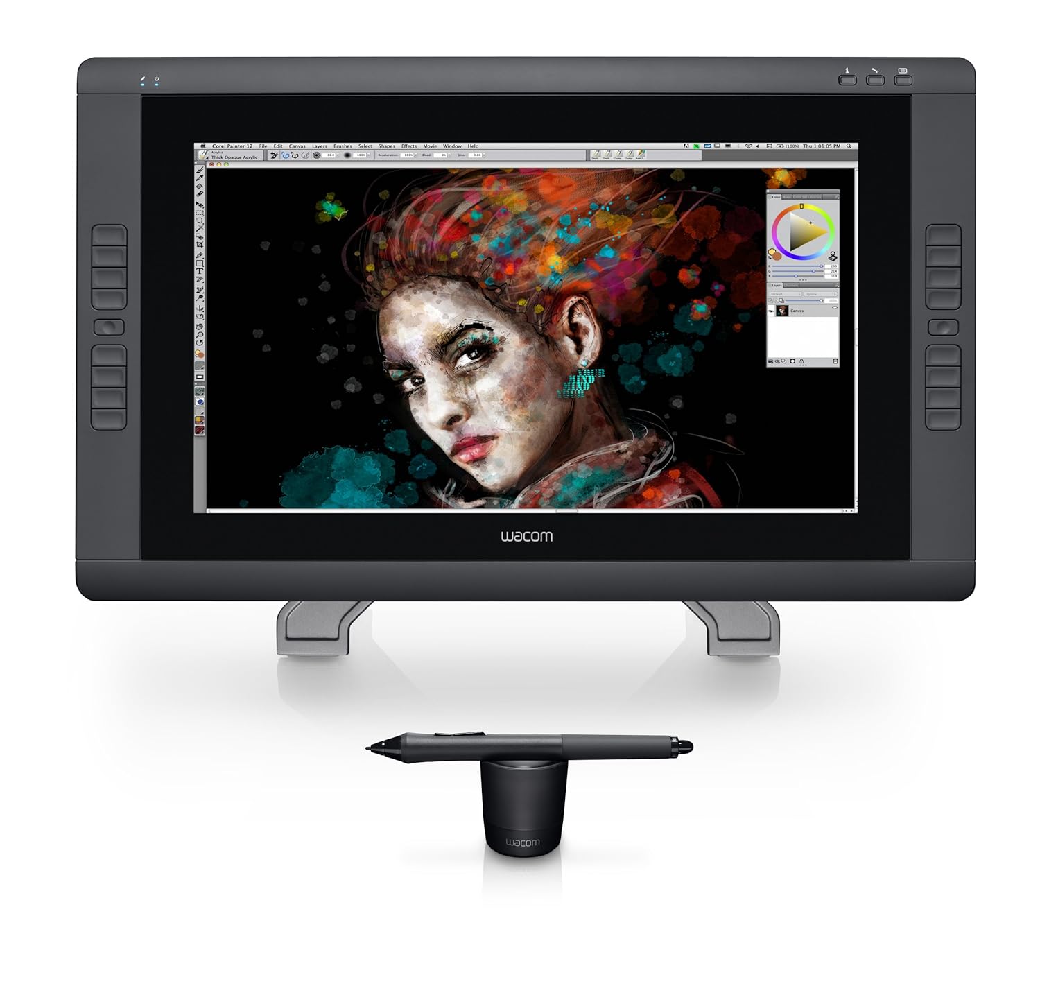
Intuos Pro
The Intuos Pro series replace the Intuos5 before. Official retail price for the Intuos Pro is from $249-$499 for a drawing surface from 6.2x3.9 inches to 11.8x7.5 inches. They cost significantly more than any other brands out there currently.
| Product | Intuos Pro Small | Intuos Pro Medium | Intuos Pro Large |
| Model No. | PTH451 | PTH651 | PTH851 |
| Active Area | 6.2 x 3.9 in | 8.8 x 5.5 in | 299 x 190 mm / 11.8 x 7.5 in |
| Pressure levels | 2048 | 2048 | 2048 |
| Tilt Sensitivity | 60 degrees | 60 degrees | 60 degrees |
| Resolution | 5080 lpi | 5080 lpi | 5080 lpi |
| Pen | Intuos pen with eraser | Intuos pen with eraser | Intuos pen with eraser |
| Multi-touch | Yes | Yes | Yes |
| ExpressKeys | 6 | 8 | 8 |
| Official retail price | USD $249 | USD $349 | USD $499 |
| Best price | | | |
| Software bundle | Photoshop Elements 11, Sketchbook Express, Anime Studio Debut 8, Painter 13 Trial (30 days), Nik® Color Efex Pro 4 Select Edition |
Here are the pros and cons for the Intuos Pro:
+ Nice sleek looking design
+ Good build quality overall, but problems exist with the USB port
+ Drawing surface has a slight texture that evokes the feeling of traditional medium, e.g. the paper.
+ 2048 levels of pressure sensitivity
+ Buttons on the tablet and pen can be programmed to keys, mouse clicks and other functions
+ Tablet is responsive even on a cheap laptop
+ Multi-touch conveniently detects fingers for zoom, scroll and other functions
+ Hand can rest easily on surface without registering unwanted touches
+ 10 assorted replacement nibs are included
+ Pen feels natural and comfortable to hold
+ Pen does not require batteries like most competitors'
+ Works for left handed users also
+ Good drivers and features for Windows and Mac
- USB port is fragile, not durable.
- Cord is short
- Pen nib can wear out fast but you can turn the sensitivity up to detect less pressure on your part
- Pen works without pressure sensitivity and tilt with GIMP
- Wifi and wireless last around 8 hours
- Wireless functionality is inconsistent at working 100%
- Some users complain that tablet and driver don't work when computer wakes from sleep
- Price is much more expensive than competition
The Intuos Pro has wireless capability. The power source is built in to be charged with the USB cable. However, the USB port build quality is filmsy so the constant plugging in and out risks damaging it. Many customers are unhappy about the fragile USB port, and the inconsistency at which the wireless works.
Wacom's pen stand is always nice. There are 10 assorted replacement nibs included, the standard black, stroke and hard felt. With the slight texture on the drawing surface, the pen nib can wear out fast when the pressure is great, and several customers recommend setting a sensitive pressure setting so that you can use less pressure while drawing.
The medium size drawing area of 8.8 by 5.5 inch is a good size to get. The large can be too big.
For the high price, relatively speaking, that Wacom are selling their tablets, the design flaw of the USB and inconsistent wireless functionality is quite disappointing. However, if you're the type who don't constantly plug out or transport your tablet, or don't use the wireless, then those problems are not going to affect you too much.
HUION
Huion is a company located in China that makes graphics drawing tablets. They have quite a lot of model numbers and it can get confusing fast. In general, their model numbers are named after the size of their tablets, e.g. model 610 would be for a 10 by 6 inches and 580 would be for 8 by 5 inches.
Price range for their tablets is insanely attractive, like several times cheaper, like OMG-I-can't-believe-that-tablets-can-be-so-cheap affordable. After you look at the price from other companies, you'll realise that it is Wacom who prices their products high, sometimes too high.
![]()
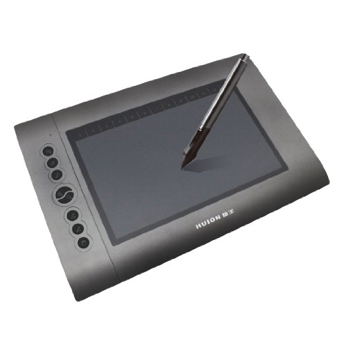
Huion 680s 8x6 inch
Key specifications: 2048 levels of pressure sensitivity, 4000 LPI resolution, 220RPS reading speed. Full specifications.
Here are the pros and cons of 680s:
+ Good pressure sensitivity level of 2048
+ Smooth surface for drawing, with texture close to paper
+ Comes with 4 spare pen nibs
+ Very affordable at under USD $40 for an 8x6 inch drawing surface
+ Very responsive, no lag when drawing
+ Works with WinXP/Vista/7/8/Mac OS
- No shortcut buttons on tablet
- Pen runs on AAA battery with reportedly 6 months battery life
- Pen has a on-off switch but is flimsy, customers usually just unscrew the back to save battery life
- Pen does not have tilt sensitivity
- Pen has no eraser
- Pen stand allows the pen to lay horizontally but not stand vertically
- Driver installation is gets mixed reviews from customers, but slightly more towards the favorable side.
- Support from Huion is inconsistent, sometimes good, sometimes bad.
At the time of this writing, the same size Wacom vs the Huion 680s is USD$300 vs $40. You can buy several Huion tablets for the price of one Wacom. The downsides mainly go to do with the pen requiring a AAA battery to power but it's a minor inconvenience compared to the immense savings.
The 680s is a barebones tablet with no shortcut buttons.
![]()
Huion 580 8x5 inch
Key specifications: 2048 levels of pressure sensitivity, 4000 LPI resolution, 220RPS reading speed. Full specifications.
![]()
Huion H580 8x5 inch
Key specifications: 2048 levels of pressure sensitivity, 4000 LPI resolution, 200RPS reading speed. Full specifications.
The specifications for the 580 and H580 are pretty similar. The difference is H580 comes with 8 Express Keys and 13 other keys that you can customise yourself. There's also another model called 58L which has 6 Express Keys, a wireless version W58 and one with a rechargeable pen K58. Additional features cost more.
Reviews are pretty mixed. General build quality and the pen is similar to other tablets by Huion. Meaning the drawing surface will have a slight texture like paper, and the wireless pen is still powered by an AAA battery. 4 replacement pen nibs are included inside the pen stand.
Complaints are mainly of the build quality with several customers reporting faulty units after a period of time, and the hassle of getting it fixed with Huion support. However, there are many customers also are satisfied with their units.
![]()
Huion H610 10by6 inch
Key specifications: 2048 levels of pressure sensitivity, 4000 LPI resolution, 220RPS reading speed. Full specifications.
The H610 sports a larger 10 by 6 inch drawing surface. There are 8 Express Keys and 16 customisable function keys.
Here's a good Amazon review of the H610 with a video included.
![]()
Huion H610 Pro 10x6.25 inch
Key specifications: 2048 levels of pressure sensitivity, 5080 LPI resolution, 233RPS reading speed.
The H610 Pro is the newer model of the H610 with a cleaner and edgier look. Specifications has improved slightly with 5080 LPI resolution and 233 RPS reading speed. This unit is more expensive than the H610 of course.
TURCOM (HUION)
Turcom Electronics is a company based in Southern California. From what I've read at several places, it seems that Turcom is a rebrand of Huion and in some cases, I see Turcom product photos sporting the Huion logo, and customers saying they received Huion tablets instead of the Turcom they ordered.
Since Turcom is just a rebrand, then you might as well just get the Huion tablets.
Their tablets come in generally two sizes, either near 8x6 inches or 10x6 inches.
![]()
Turcom TS-6580 8x5 inch
The Turcom TS-6580 is a 8x5 inch size drawing tablet that comes in two colours, either white or black (identified as TS-6580B). It's a budget tablet at under $50 for an A5 size drawing surface. This model came out in 2012.
Here are the pros and cons of the TS-6580:
+ Good resolution of 4000LPI
+ Pressure sensitivity levels is 2048 and works well
+ Pen reading speed 200 RPS
+ No lag
+ Drawing surface is about A5 size
+ Construction quality is solid
+ Pen is lightweight, and weight is contributed by the AAA battery
+ Comes with pen rest cup
+ Comes with 4 spare pen tips
+ USB cable is lengthy
- Pen feels a bit cheap with some customers complaining it breaks down
- Nib wiggles a bit
- Pen is powered by AAA battery (included)
- Pen has no eraser
- Driver installation from disc is not straightforward. Download drivers from website if necessary
- Manuals are not useful. You'll do better with the drivers downloaded from Turcom's website.
![]()
Turcom TS-6W58 8x5 inch wireless
The specification for this wireless tablet is similar to the TS-6580 above. There's only one useful but unfavorable review on Amazon complaining about the driver that's supposedly causing faulty wireless function.
![]()
Turcom TS-6608 8x6 inch
This tablet with rounded corners also has a resolution of 4000LPI, 200 RPS reading speed and 2048 levels of sensitivity. This model came out in 2013.
I found out that equivalent Huion model is a P608N and the driver on the disc you should use is H610. And Turcom's website has only a TS-5508 instead of the TS-6608. Confusing. What's interesting is you can get the equivalent drivers from Huion's website as well.
Below's a video of the TS-6608 unboxing:
![]()
There are two rolls of touch buttons at the top and bottom of the drawing area. The icons come with labels so there's no mistaking what they represent. There are also buttons by the sides, and you can actually program them to open specific applications. Handy. You access the buttons with the pen.
TS-6608 has it fair share of good and bad reviews. Most of the bad reviews focus on the durability of the pen and confusing driver installation process. There's no power switch for the pen and to save electricity you have to unscrew the back of the pen, although the pen is supposed to power off automatically after 10 minutes. AAA batteries are cheap anyway.
All these points should will apply to the Huion since Turcom is selling the rebrand.
UGEE
UGEE is another company in China that makes graphic tablets.
![]()
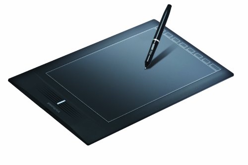
Ugee M708 10x6 inch
Key specifications: 2048 levels of pressure sensitivity, 5080 LPI resolution, 230RPS reading speed, 8 Express Keys
Reviews for the Ugee M708 is surprisingly positive.
Pros and cons of M708:
+ Beautiful thin (0.25 inch thick) design
+ Good build quality
+ Big 10x6 inch drawing surface
+ Pressure sensitivity works well
+ Drawing surface has a slight texture to mimic paper
+ Works on Windows/XP/Vista 7,8, Mac OS with updated drivers from their website
+ Comes with 8 spare pen nibs inside the pen holder
+ 8 Express Keys on the left
+ Can be used be left and right handed users
- Micro USB to USB cable is short. It's detachable so you can use your own long one
- Drawing surface scratches easily
- Pen uses AAA battery
- Pen has no eraser
- Pen has no tilt sensitivity
- Driver installation can be confusing for some.
![]()
Ugee M1000L 10x6 inch
Key specifications: 2048 levels of pressure sensitivity, 4000 LPI resolution, 200RPS reading speed.
Some difference between the M1000L and M708 include the slightly lower, but still high, resolution of 4000 LPI. In addition to the 8 physical Express Keys, there are also 16 customisable buttons on the drawing surface that can only be accessed with the pen.
![]()
Ugee G3 9x6 inch
Key specifications: 2048 levels of pressure sensitivity, 5080 LPI resolution, 220RPS reading speed, full specifications.
The Ugee G3 is a simple sleek looking tablet with a very smooth drawing surface. There's support for left and right handed users.
The wireless pen uses AAA battery with a 5000hr battery life. There's a battery life indicator light. Hidden inside the pen stand are 8 replaceable pen nibs. The pen stand can hold the pen vertically.
It's really quite a bare bones tablet with no shortcut buttons. Despite the simplicity, it actually cost slightly more than the Huion H610 which is larger and has more features, and hence more value for money.
![]()
Ugee G5 9x6 inch
Key specifications: 2048 levels of pressure sensitivity, 5080 LPI resolution, 220RPS reading speed, full specifications.
The Ugee G5 is one model up and is a tablet with some interesting features. It has this G-Flash which is actually a 8GB flash drive that allows you to store your files - basically just think of the tablet as a super huge USB flash drive. You can store your files on the drive and bring the tablet around. The driver software is on the flash drive also but remember that you will want to download and install the driver before you plug in the tablet.
![]()
The swivel button on the G5 has several functions as well. You can use it to control brush size, zoom, rotate canvas, scroll or turn pages. In the centre of the circle is a button when pressed allows you to change the function (which appears on screen). The outer ring has smaller buttons that you can further customise for other functions.
The drawing surface is smooth. Overall design is sleek and the bezel is thin so the overall tablet is quite compact that can still accommodate a nice 9x6 inch drawing surface.
There's no mention on whether it supports both left and right handed users.
MONOPRICE
Monoprice is a consumer electronics company in USA that was established in 2002. They are known to compete on price.
The tablets they sell look like they are rebranded from Huion. There's one particular tablet Monoprice 110594 which looks exactly like Huion H610.
The two main tablets worth looking at are Monoprice 10x6.25 inch (model 110594) and Monoprice 8x5 inch (model 110593) which are both released towards the end of December 2013. Both are budget graphics tablet under $70.
Keys specifications: 4000 LPI resolution, 200 RPS reading speed, 2048 levels of sensitivity.
![]()
This is the Monoprice 10x6.25 inch graphics tablet. It looks exactly like the Huion H610. I guess it's the same tablet just with a rebrand.
It comes with 8 physical Express Keys and a row of 16 programmable buttons at the top of the drawing surface. The 10x6 inch model is a better buy compared to the 8x5 inch model which just has 6 Express Keys. Price difference at time of this writing is just around $10.
VisTablet Systems is founded in 2007 and is a wholly owned subsidiary of YSB World Corporation that is based in Los Angeles, USA. Their tablets are more pricey but still cheaper than Wacom. But for the extra price, you get customer service based in California. They offer a 2-year warranty for their tablets.
![]()
VT Realm 10x6.25 inch
Keys specifications: 4000 LPI resolution, 200 RPS reading speed, 2048 levels of sensitivity. Full specifications.
The VT Realm is a 10x6.25 inch graphics tablet with a good build quality. The drawing surface is for widescreens monitors and smooth to draw on. There's a column of 8 shortcut keys on right side of the tablet that are pre-programmed to certain functions but you can customise them yourself too. Cable is fairly long.
Pen is glossy which is prone to stickiness and fingerprints. It's powered by one AAA battery. Pressure sensitivity works well. There's a pen stand that allows the pen to stand vertically. The related downside is the inclusion of just 2 replaceable nibs.
While the company claims to support Mac, a few customerscommented that the drivers don't work too well with Mac.
There are less than 30 reviews on Amazon and most are favorable. So this is certainly a tablet to consider
![]()
VT Realm Pro 8x5 inch
The VT Realm Pro is the new edition of the VT Realm. It's smaller but more expensive. It's set to be released in November 2014 so there aren't any reviews yet.
Key specifications: 5080 LPI resolution, 200 RPS reading speed, 2048 levels of pressure sensitivity with 60 degrees of pen-tilt sensitivity, pen is battery free.
There are three groups of shortcuts, two are the dial wheels and one set of 4 buttons.
PenPower Inc is a company founded in 1997 based in Taiwan. Their products are in the area of business productivity software, Asian language-based software and mobile electronics.
![]()
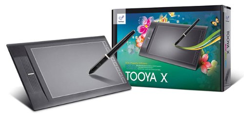
Tooya X 10x6.26 inch
Tooya X is the recent upgrade to the Tooya Pro what was released in 2008 to mixed reviews. The Tooya X is quite a competitively priced.
Keys specifications: 4000 LPI resolution, 200 RPS reading speed, 2048 levels of sensitivity. Full specifications.
The pen also uses battery. The drawing surface is 10 by 6.25 inch and comes with 8 shortcut keys.
Few reviews exist and those that do mention that the graphics tablet don't work well on Mac because of outdated drivers. The actual quality of this tablet is mostly unknown.
CONCLUSION
Problems to installing drivers isn't limited to other brands as Wacom also has some customers who comment on their frustrations with the drivers.
Overall, I'm really quite impressed and shocked by how low prices set by other companies. Put in other words, it really forces potential customers to wonder if the features and brand power of Wacom is worth the extra hundreds of dollars.
I can't recommend any one particular drawing tablet as the best because I've not used them all. Each brand has their own compromise in terms of pricing and features. But I will recommend checking out Wacom, Huion and VisTablet.
Using other drawing tablets besides Wacom?
If you use graphic tablets from other brands beside Wacom, share your comments below and reviews on Amazon.